Whats involved
3D Design
Animation
App Design
Brand Strategy
Full Brand
Design Strategy
Graphic Design
iOS Application
Marketing Design
Marketing Strategy
Project Overview
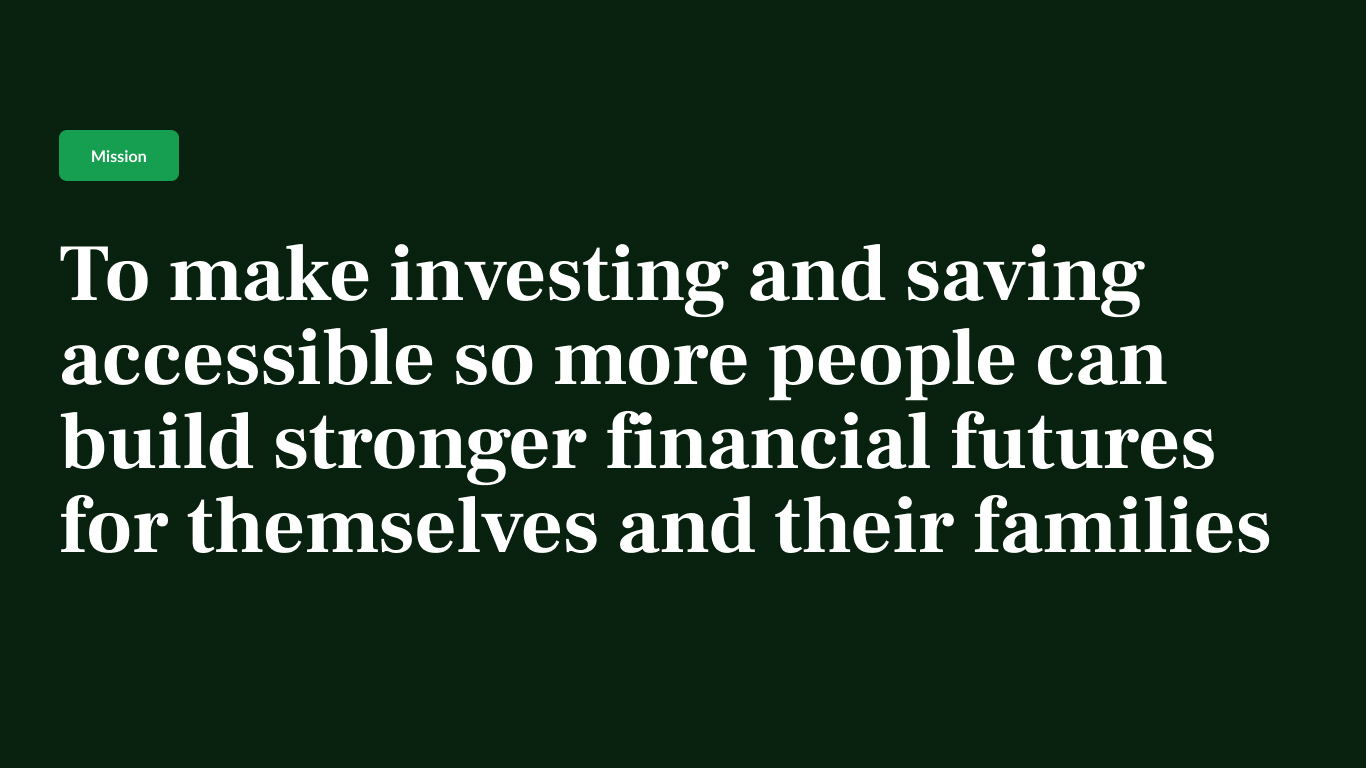
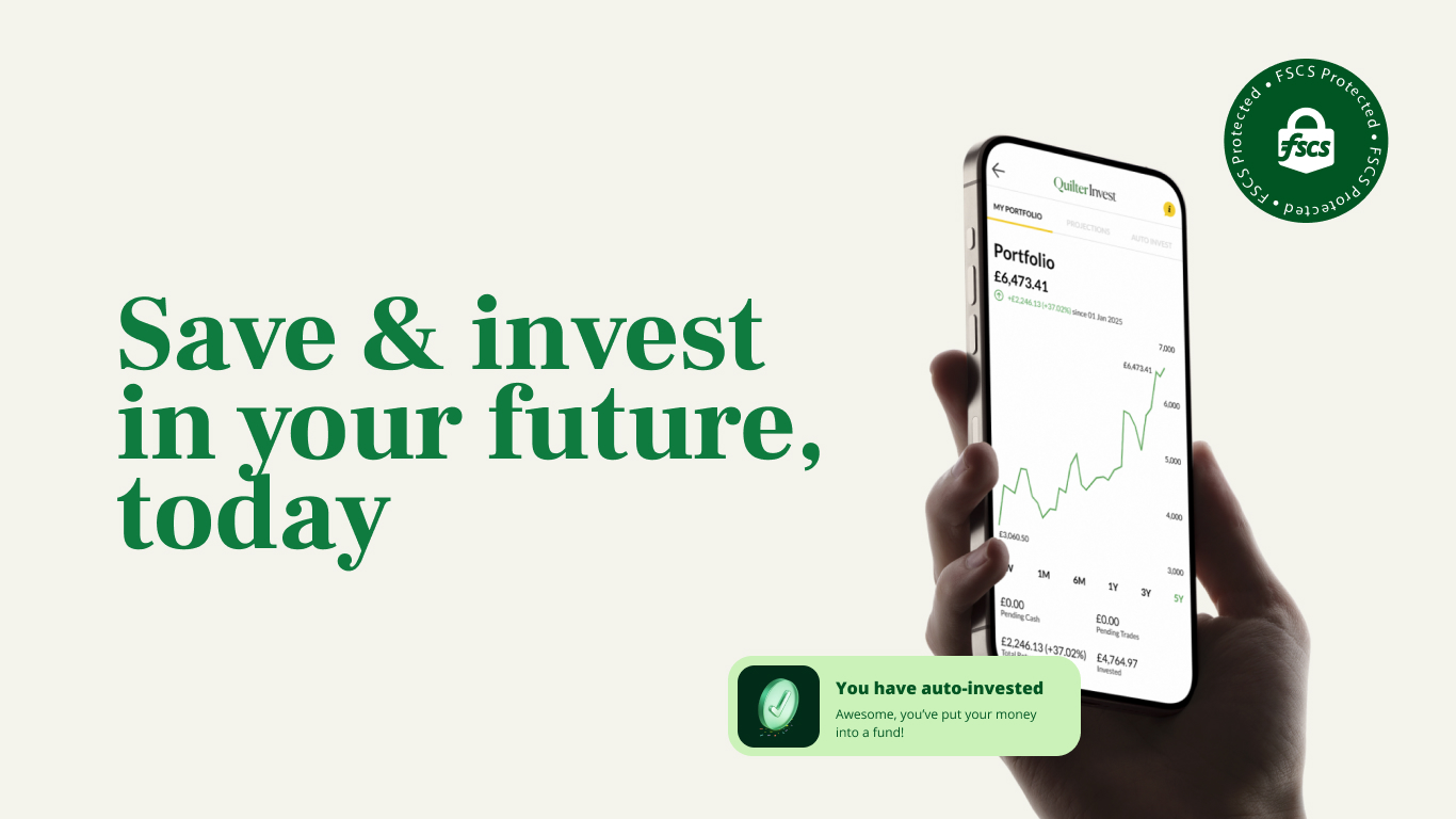
Making a startup look grown-up without making it boring Quilter (FTSE 250) acquires NuWealth (fintech startup). Needs brand integration. Can't afford brand destruction. Built: Flexible design system + 34 custom 3D icons + visual language that works for both 60-year-old wealth advisors and 22-year-old first-time investors.

Challenge
Following Quilter's acquisition of NuWealth, the parent company needed to integrate the new platform into their broader brand architecture while maintaining its appeal to a younger, digitally-native audience. The challenge: how do you bring a fintech startup under an established financial services brand without losing what made it distinctive? Both brands served different audiences with different expectations. Quilter needed family brand consistency across their £5bn+ group. NuWealth needed to retain its accessible, modern identity that resonated with first-time investors. A complete rebrand would alienate existing users. No change would confuse the market and miss acquisition synergies.


Strategy & Approach
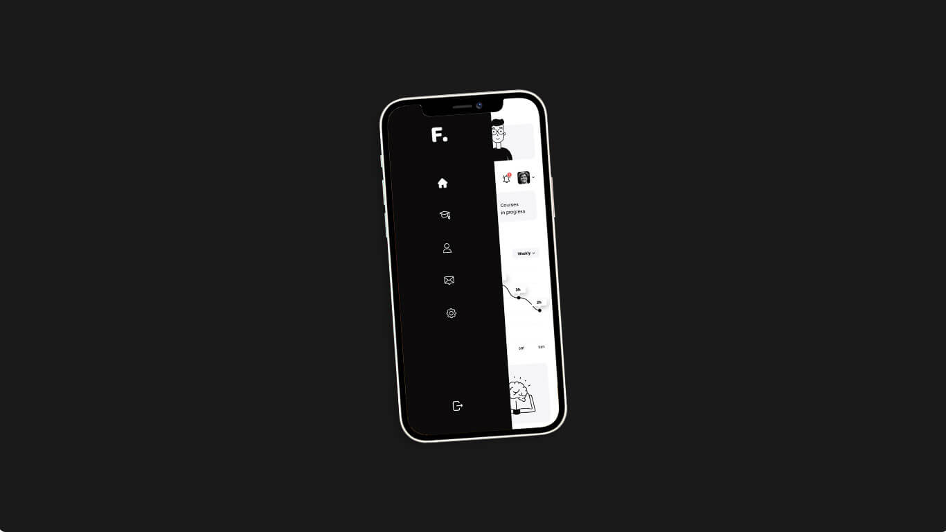
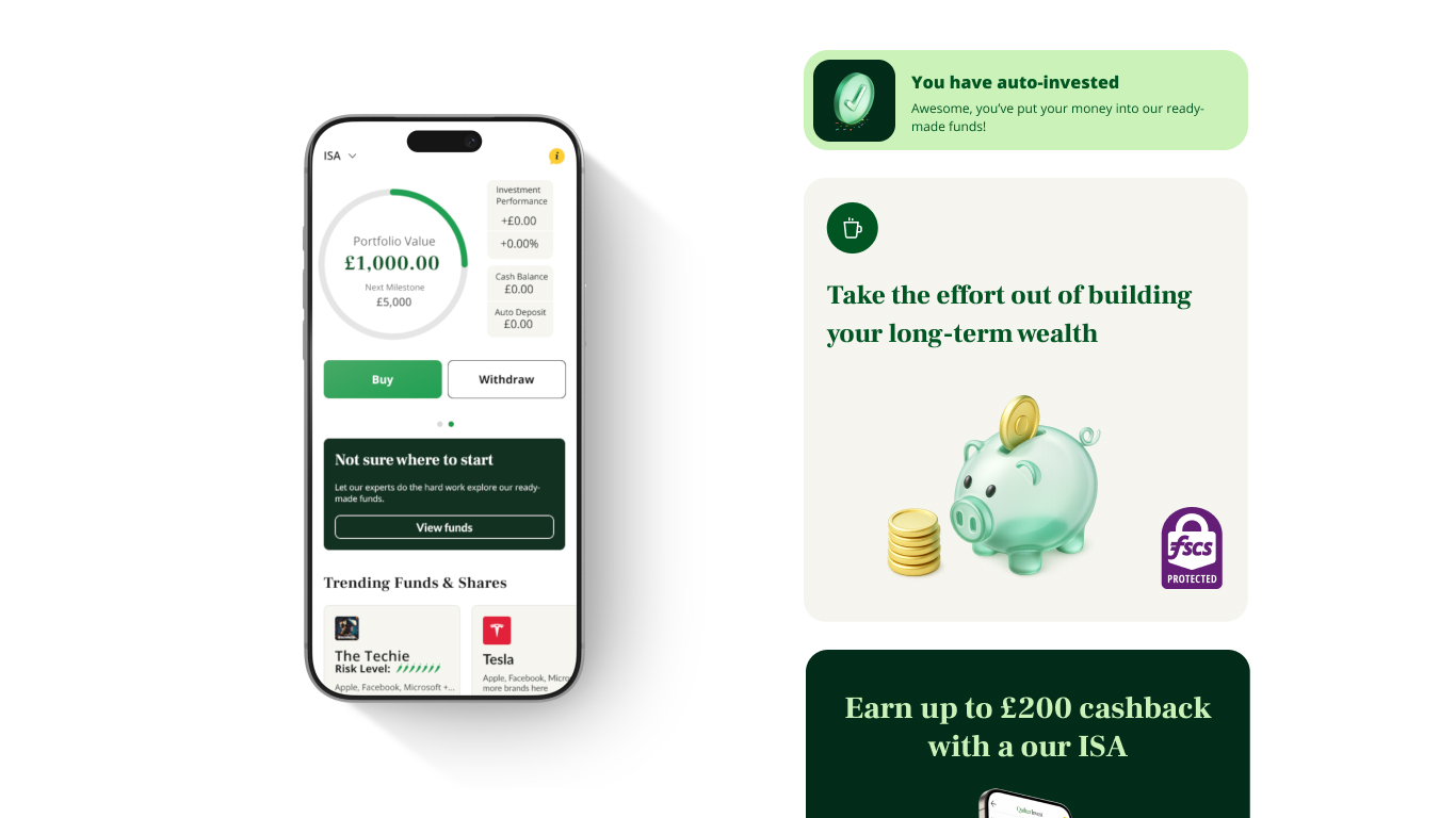
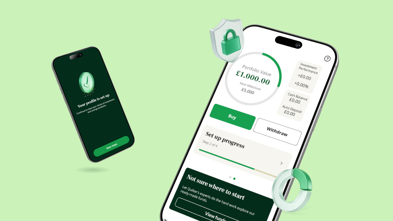
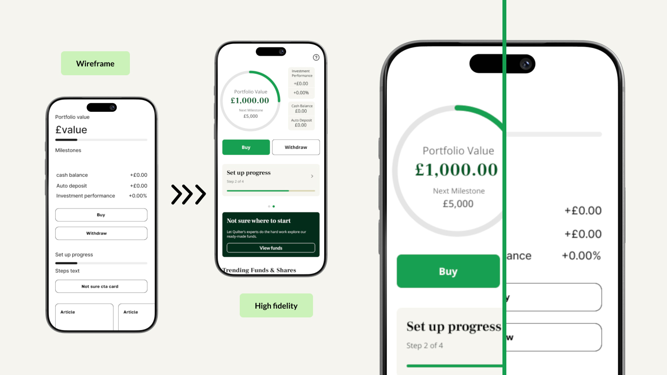
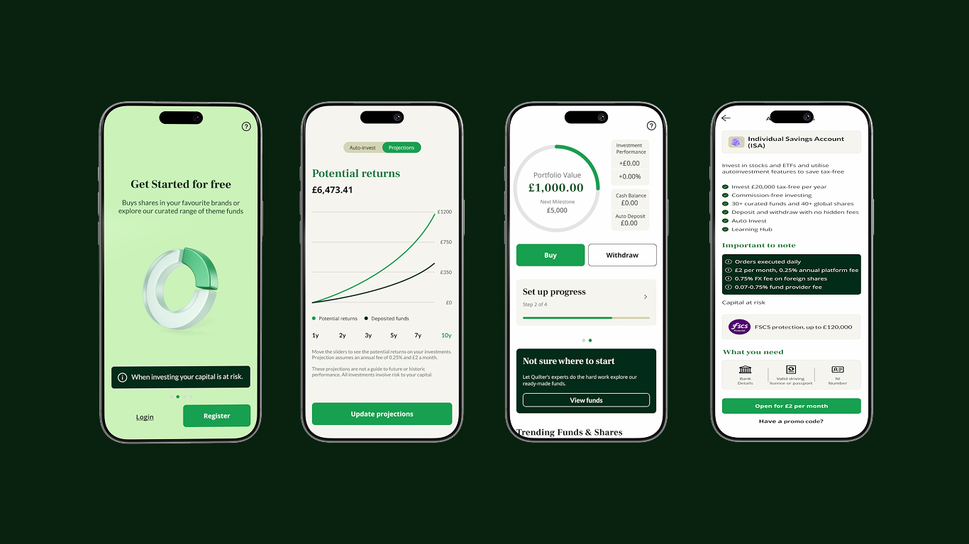
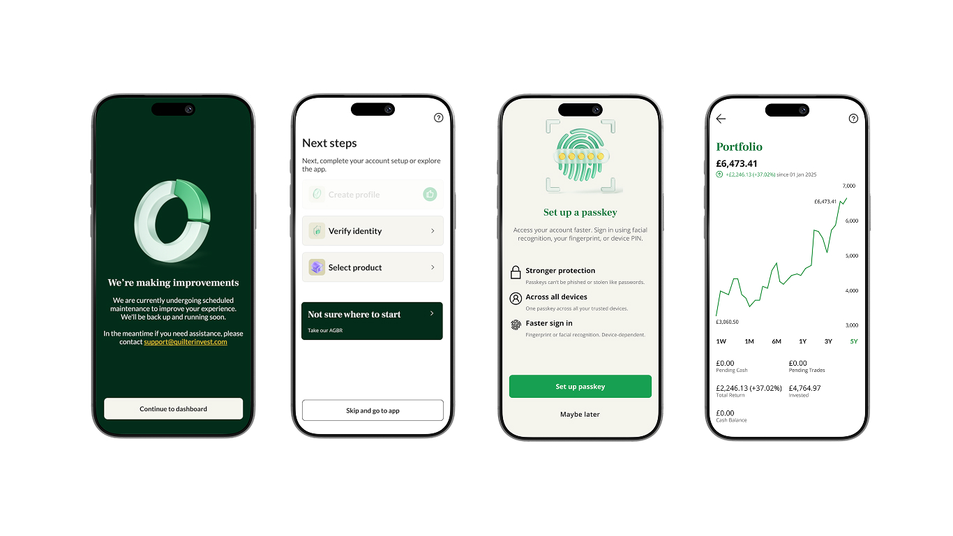
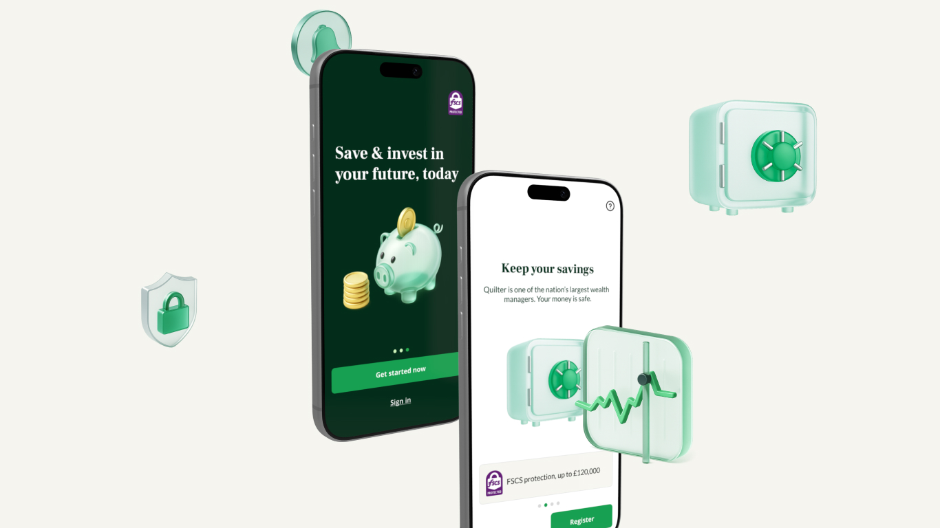
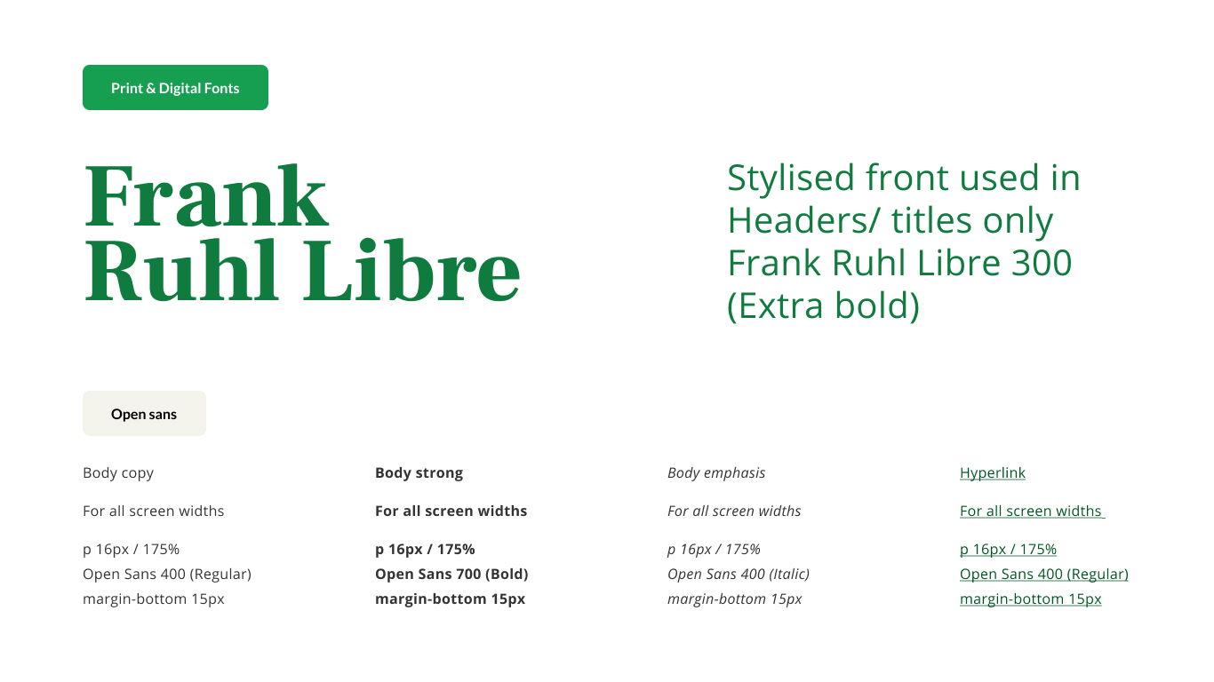
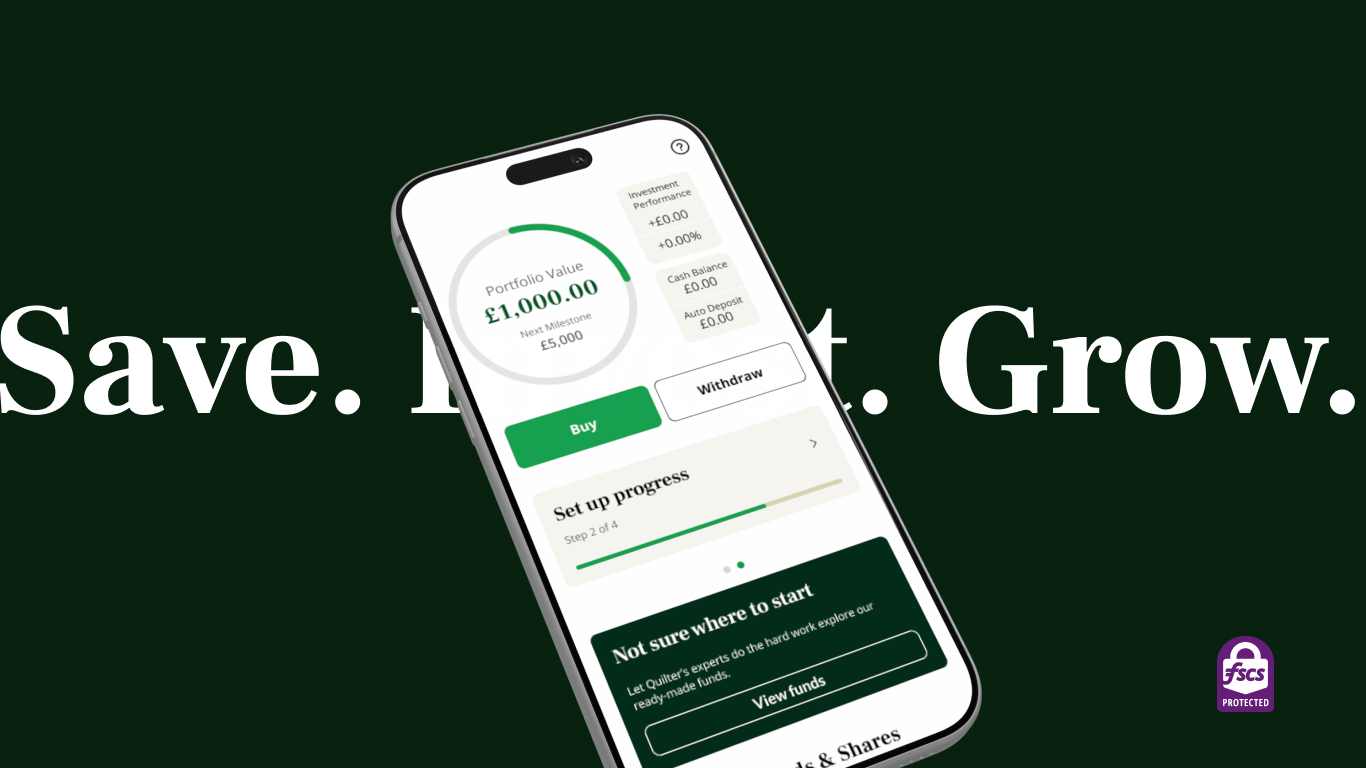
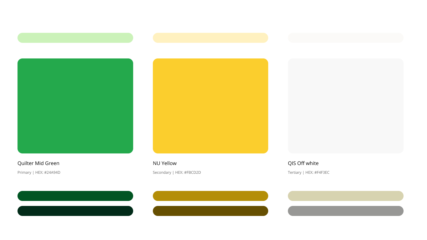
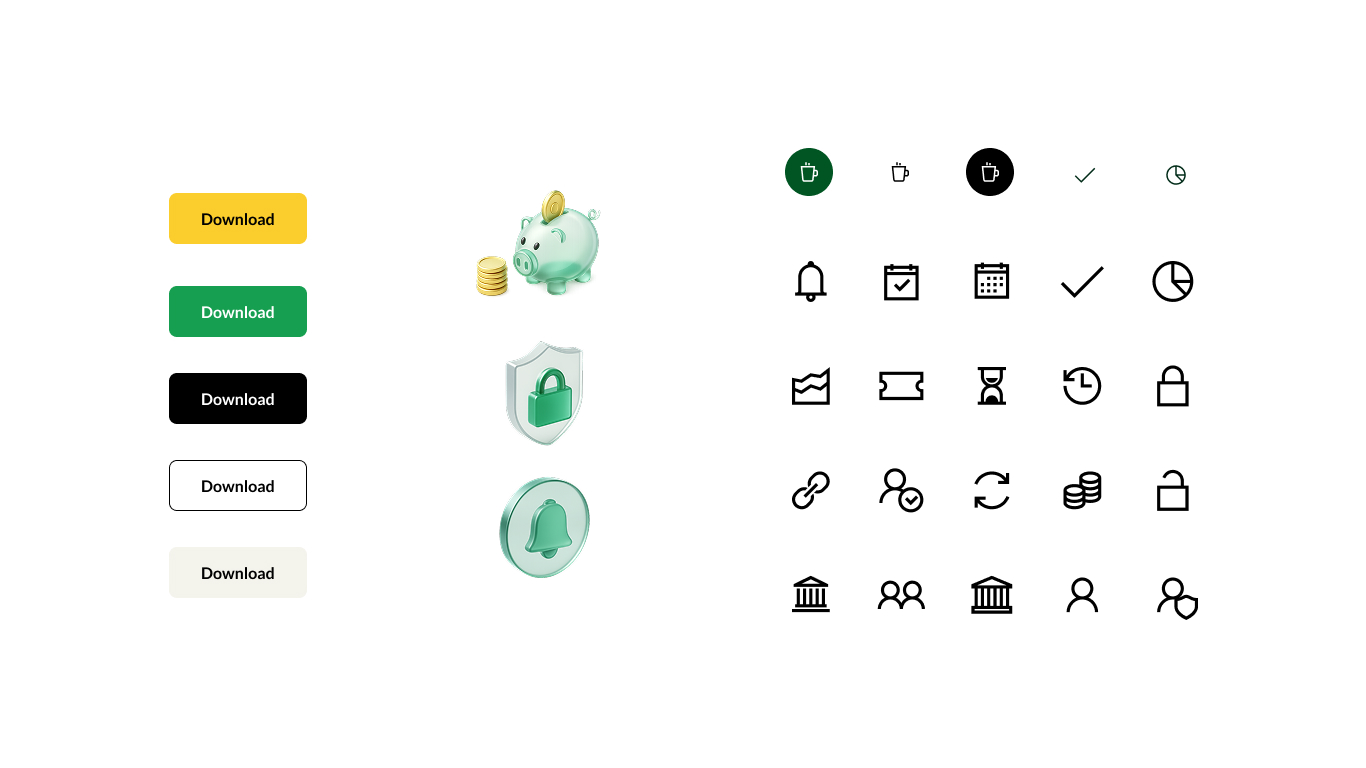
Rather than force-fitting NuWealth into Quilter's corporate identity, we created a visual bridge—bringing the platforms into alignment while preserving NuWealth's distinct personality. Brand Architecture: Developed a "branded house" approach where Quilter Invest operates as a sub-brand within the Quilter family. Clear visual connection to the parent brand while maintaining product-specific expression. Visual System Updates: Evolved color palette to incorporate Quilter's brand colors while retaining NuWealth's vibrant, approachable tones Created new iconography system with 34 custom 3D glass icons—premium feel that differentiated from flat corporate style Refined typography to balance Quilter's professional tone with digital-first accessibility Updated UI components to feel more sophisticated without losing usability Design System Integration: Built new design system that could flex across both brand requirements—components that adapt to context while maintaining consistency. This allowed marketing to lean into Quilter brand equity while product retained its distinctive interface.
The Result
The reality of acquisition work: Perfect execution meets imperfect business circumstances. The rebrand achieved its core goal, integrating NuWealth into Quilter without destroying what made it valuable. But like most enterprise projects, the final result reflected compromise between design vision and business reality. Key learning: Sometimes the best design outcome is creating systems resilient enough to survive the chaos of organisational change.