Whats involved
Desktop
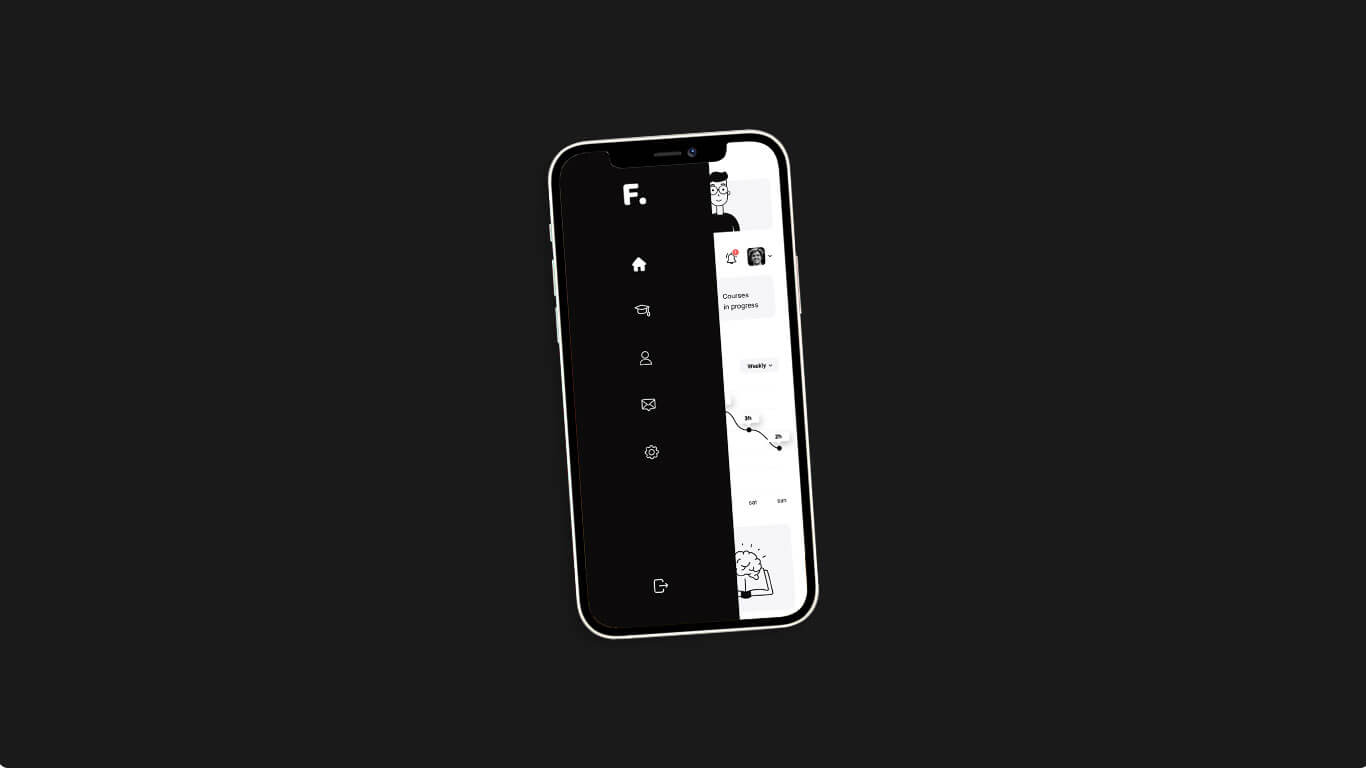
Mobile
Tablet
Project Overview
Finastra wanted to give their tired old unusable backend client dashboard a much needed refresh. Finastra partners are vital cogs and need to have an easier way for them to create and manage deals. The old platform suffered from outdated practices and over complicated language.


Challenge
Finastra have been using a Partner Portal to manage their business, though it wasn't doing what it was supposed to. The platform was cluttered, too complicated and confusing for their users. Which resulted in a decline in partner deals.


Strategy & Approach
We were tasked to revamp the existing platform and make the Partner Portal user more friendly. Over the course of 3 months we redesigned the version 2.0 of the Partner Portal, working on the new features and improving usability. From the usability sessions with the Finastra team & clients, we extracted some constructive insights and used that to really tailor the user's journey.
The Result
The released version has been well received by all the Finastra partners and showed positive results. Making the whole process a lot less complex has allowed for more deals to be created quickly and easily resulting in more partner deals.